|
|
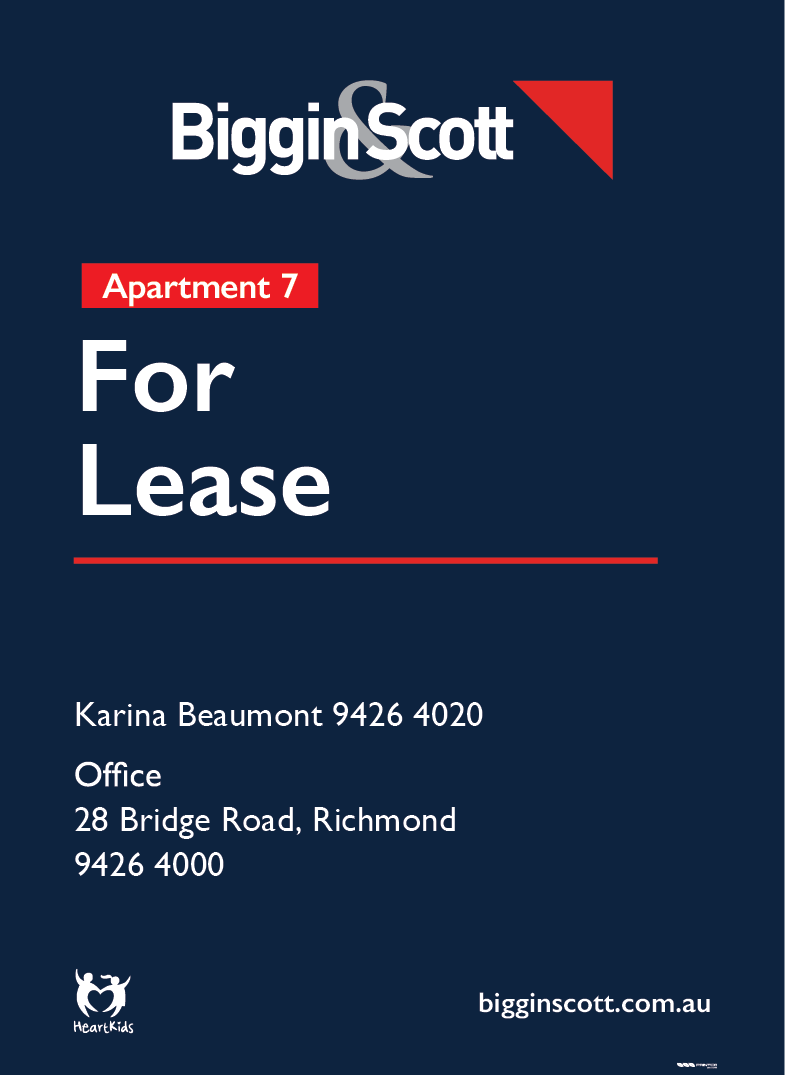
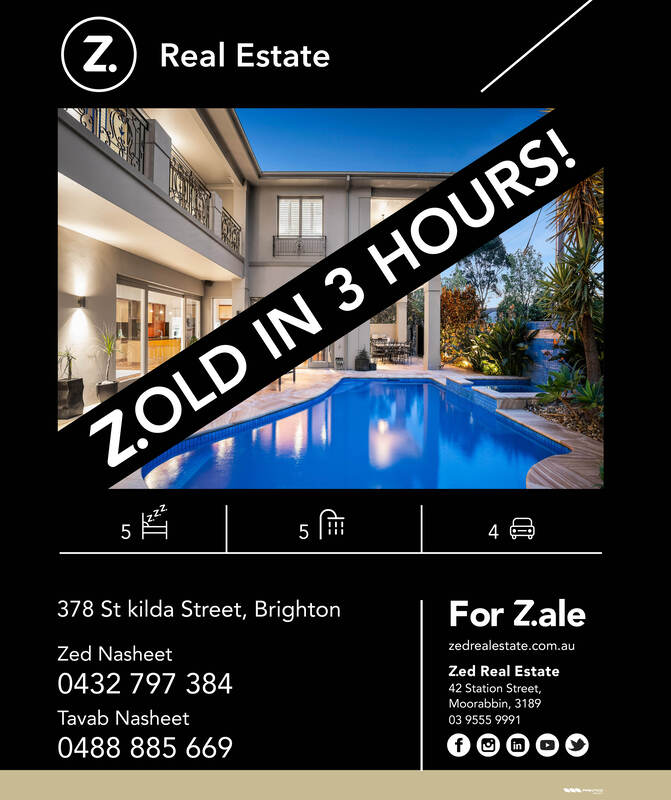
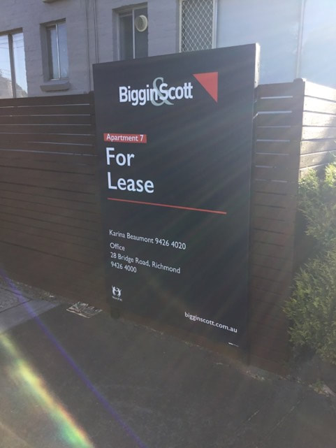
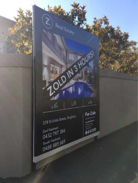
Printco, Melbourne, AusWhen my feature film was accepted into the Sydney Indie Film Festival was I fortunate to take the jump out of my teaching career to go to Australia initially for the festival but also to do some travelling. Out there I was employed as a graphic designer in which my role entailed responding to client briefs to design and prepare billboards for real-estate marketing campaigns.
|
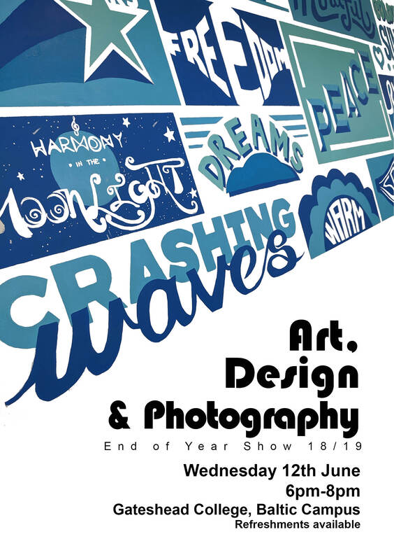
Gateshead College end of year student art showI have been working as a teacher of digital art for Art&Design and Computer Games courses at Gateshead College, UK. In preparation for the final art show of the year 2019 I was asked to put together a flyer to be used as part of the colleges online presence and to print to hand out to parents, industry professionals from the local area and prospective students.
I used an image of a Typographic wall mural the students worked on earlier in the year to edit and adapt to create a typographic illustrative editorial piece. |
|
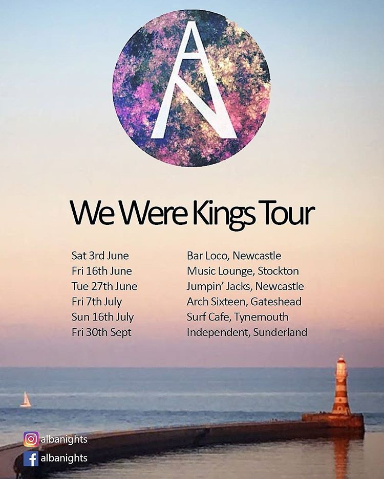
Alba Nights - 'We Were Kings' tour posterAlba Nights are a local Sunderland recording and touring 5piece indie rock band who, following the release of their 2017 album, Soliloquies - went on a Northern UK tour. the tour was named after the single from the Album, King.
I used some of my own photography of the Sunderland coast line which included a shot of Roker Pier and lighthouse. I used colours from the sunset to develop the logo in an illustrative fashion and used smart and simplistic typography to deliver the relevant information for this editorial product. On a side note, I actually play bass on 2 of the recorded tracks on the album. |
|
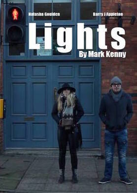
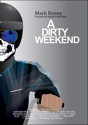
Mark Kenny FilmAs mentioned in my bio, alongside being a graphic designer I am also developing as a filmmaker. Over the past 8 years I have involved myself in a number of short and feature films including writing and producing my own.
Here are the art covers I have created for the online and print marketing materials for each of my films which show a range of my skills in photography, illustration, typography and editorial design. More information on my film making career can be found at; |


|
|
Gamerama GameMaker 2016For this I was comissioned by Gateshead Libraries to put together an editorial flyer to hand out to their young creative members. It was for a competition to come up with a game concept.
There was a lot of written information they wanted to be included on the product, as well as a specific and limited colour scheme as it was in collaboration with Gateshead College and needed to fit within their marketing guidelines. |

|
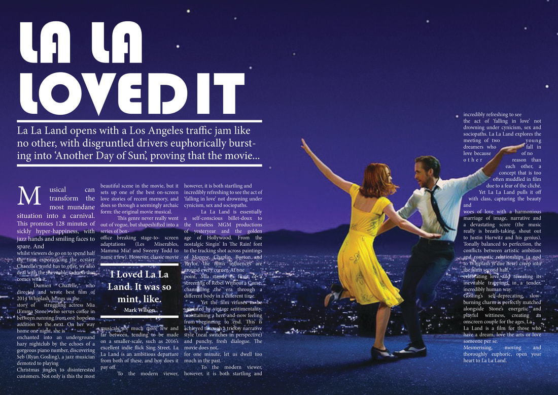
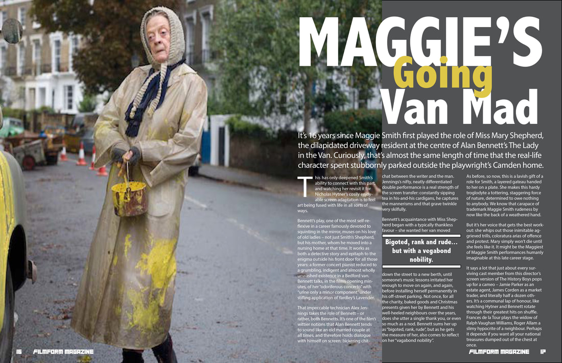
Double Page Spread designsAs aprt of the evening graphic and editorial design adult course that I wrote and delivered, I passed on my skills in adobe InDesign. To do this we used a couple of films that were out or recently out at the time and I took the students through a step by step demonstration - in doing so i created these double page spreads which included each of the little tips and tricks on how to work with type and image for print publications.
|
|
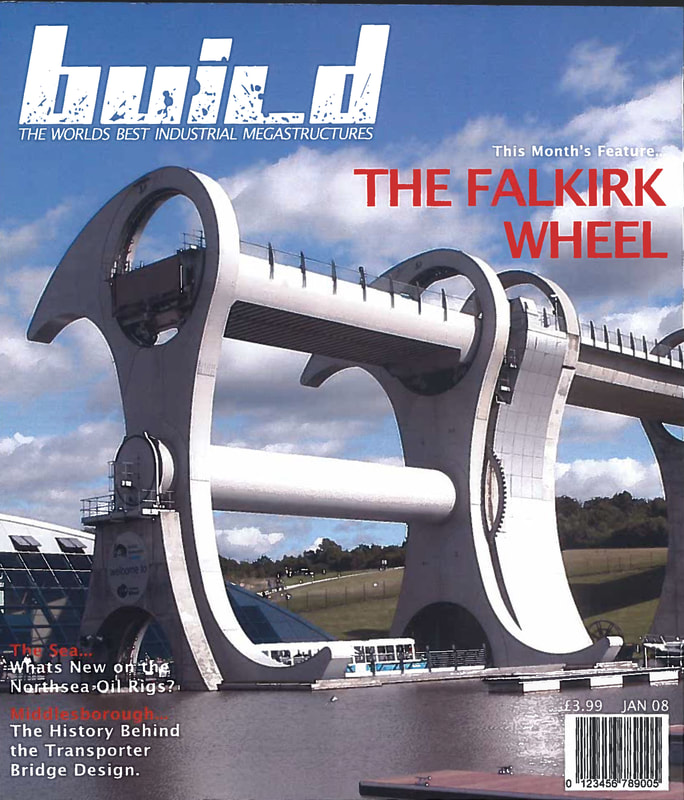
BUILD magazineThis is an old piece in my portfolio from my second year of university way back in 2009. The brief was to work with image and type to create a magazine cover for a fictional magazine - BUILD. It was uo to us what the magazine's topic was, as I have an interest in architecture and artistic engineering - I opted for features such as The Falkirk Wheel - an amazing piece of art and engineering for a rotating boat life in Falkirk Scotland.
|
|
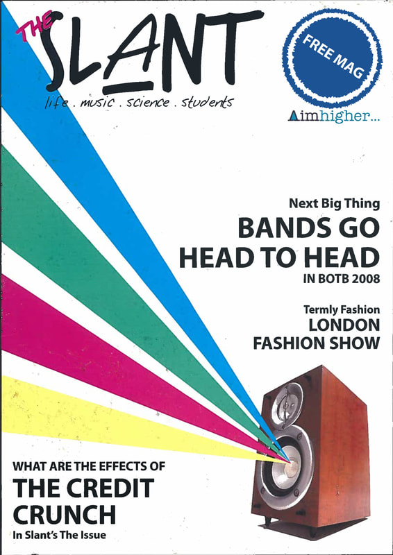
SLANT MagazineAnother old uni project however this one we weren't able to use photography - we had to create digital illustration and typographic design to work for an editorial magazine cover.
The magazine is fictional and the brief was delivered by 'Aimhigher.' |
|
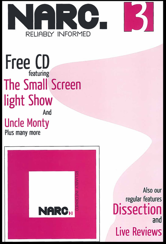
NARC MagazineNarc Magazine was a local arts and music monthly publication based in Tyne & Wear, UK. As part of my graphic and editorial course at University they came in and ran a competition for the front cover design of their next edition.
This was a challenging brief as the magazine was a low cost printed free magazine - as such the paper and print was very low quality with limited capabilities (this was also way back in 2007). We weren't able to use any photography or small print - and could only use a limited colour pallet of Black and pink - we could however alter the transparency. Although I did not win the competition on this occasion, elements of my design were used in future editions. |
|
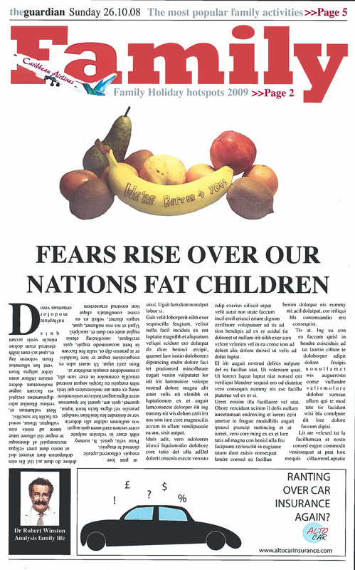
The GuardianThis was another typographic design project from my university days way back in 2007-08. This time instead, of focusing on the digital-for-print design elements of mastheads and headlines, we had to explore other ways we could experiment with typographic design using alternative mediums, also how to make bodies of article-text more interesting.
Here I was challenged with a Guardian newspaper section with the subject of the childhood obesity crisis of 2008. I explored using photography and typography by writing on a banana and using the subtle positioning to give the form of a smile. I went on to experiment with the shapes of newspaper text columns to suit the subject of the article in a subtle way. |
|
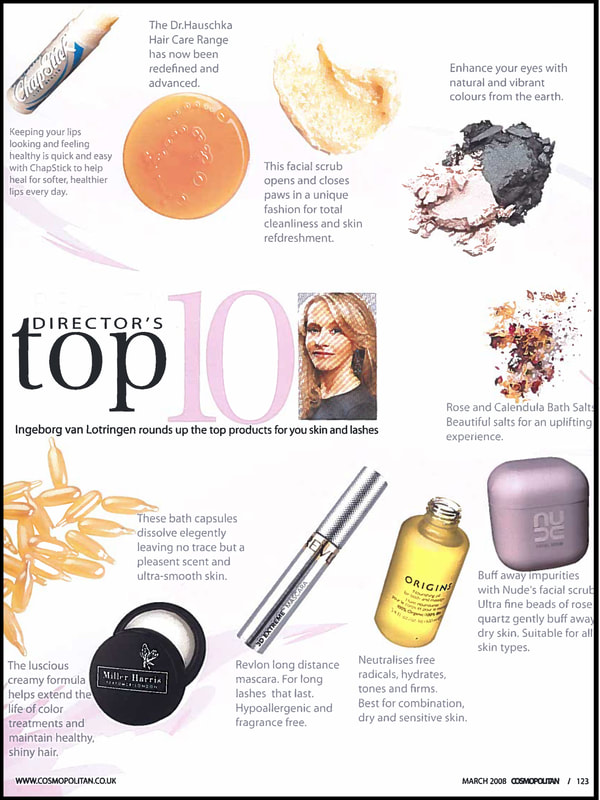
CosmopolitanWhile at uni we were given a number of 'live briefs.' For one of the projects we had to create an editorial page design for an article named, 'Directors Top 10.' This was essentially an article where the magazine gave a brief review of a range of cosmetic products.
|
|
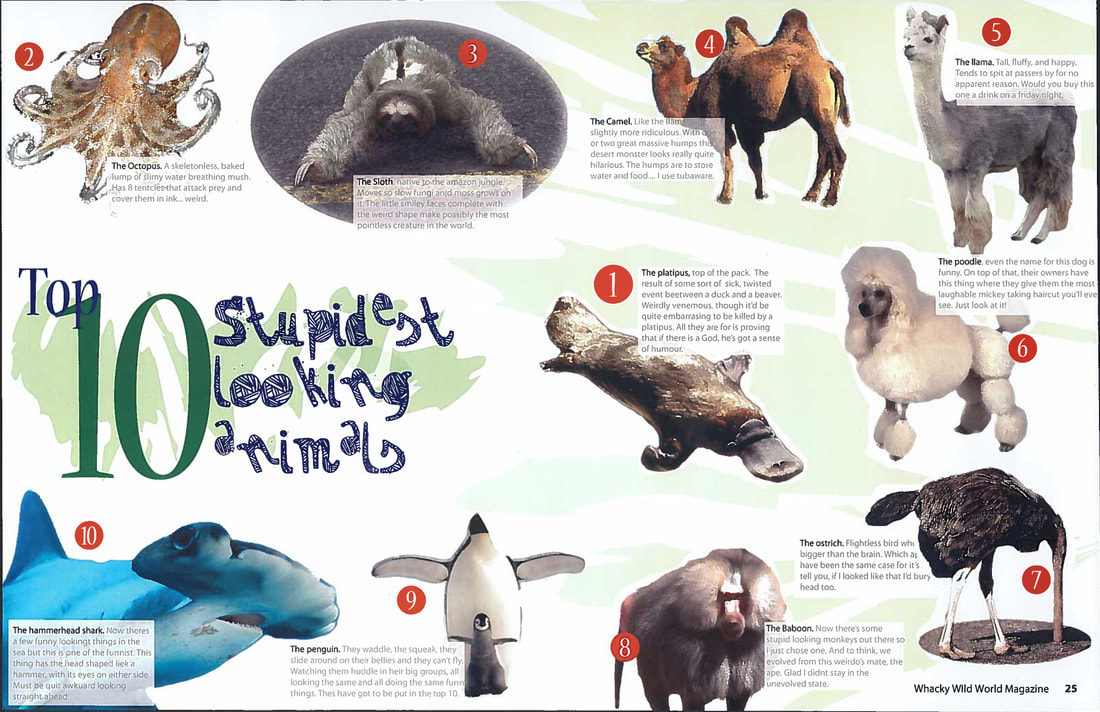
Children's magazine editorial designThis was a very open uni editorial brief - we were asked to create a double page spread for a children's magazine. As I have an active interest in wildlife and the extent creatures can differ in looks, and characteristics depending on where in the world they are from - I went for a fun yet informative approach that would appeal to young children learning about the world around them.
|
|
